
The Best Cool Calming Palettes for Bedrooms to Enhance Relaxation
Let’s be real — your bedroom should feel like your peace zone, not the backdrop for a caffeine-fueled episode of chaos. If you’ve ever walked into your room after a long day and thought, “Yikes… this feels more like a storage unit than a sanctuary,” you’re not alone. The good news? You can fix that vibe fast with the right cool and calming color palette.
I’m not talking about a Pinterest-perfect makeover that costs a month’s rent. I mean smart, mood-boosting shades that make you exhale the second you walk in. So grab a cup of tea (or let’s be honest, wine) — we’re diving into the wonderful world of bedroom color psychology, easy combos, and my personal favorite calming palettes.
Why Color Matters More Than You Think
You know how stepping into a spa instantly makes you whisper for no reason? That’s color psychology doing its thing. Cool and calming palettes — think blues, greens, greys, and neutrals — literally lower your heart rate and signal your brain to chill. Calming paint colours, such as soft blues and gentle greens, are known to create a tranquil and relaxing atmosphere, making them ideal for restful spaces.
Ever wondered why hotel rooms lean on white sheets and muted tones? It’s not just because they’re trying to hide the fact that fifty other people have slept there. It’s because calm colors = calm minds.
Here’s the quick sciencey bit (don’t worry, no quiz at the end):
-
Cool colors (blues, greens, soft purples) promote relaxation and serenity, influencing your feelings and overall mood.
-
Neutral tones (greys, beiges, taupes) add balance and sophistication, and can evoke feelings of calm and comfort.
-
Too much warmth (reds, oranges, neon yellows) can actually make you restless or heighten intense feelings.
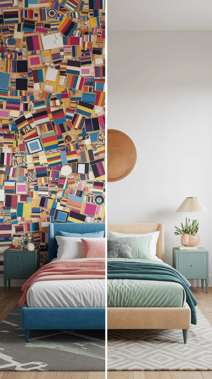
Basically, if your bedroom currently looks like a circus tent, it’s time for a palette detox. Choosing the right palette can have a calming effect on your mind and body, helping you create a peaceful retreat.
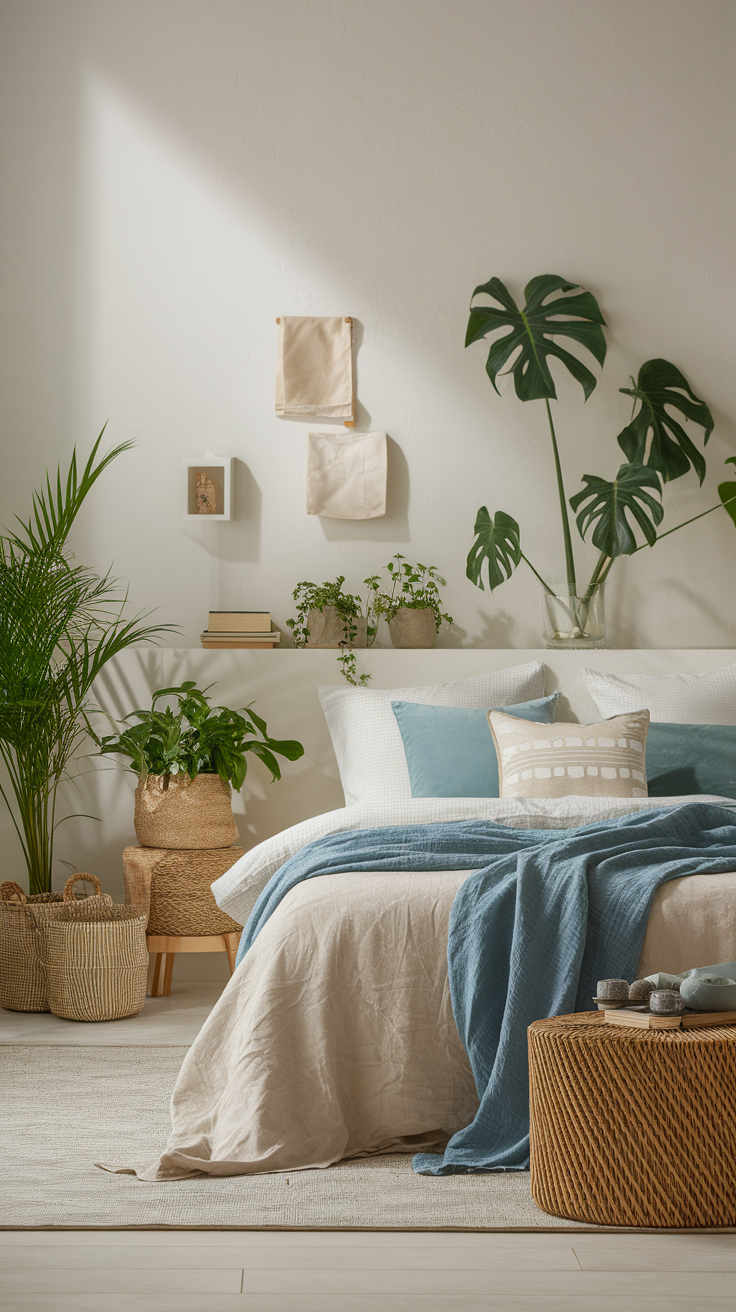
1. Soft Blues: The Classic Chill-Out Shade
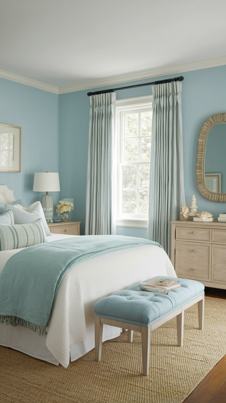
If calm had a color, it’d be blue. Seriously, soft blues are like the emotional support animal of paint colors. These soothing hues promote relaxation and help create a restful atmosphere. They create an instant sense of peace without feeling cold or sterile.
Why it works: Blue mimics the sky and the ocean — both naturally relaxing visuals.
Try this combo:
-
Bedroom walls: Misty blue or powder blue calming colours
-
Accents: Crisp white, pale grey, or warm beige
-
Textures: Light linen bedding, whitewashed wood, and cotton throws
Ever slept in a seaside cottage? That’s the vibe. You’ll feel like you’re waking up inside a cloud — in a good way.
Pro tip: Avoid overly dark blues unless your room gets tons of sunlight. Otherwise, you might turn your sanctuary into a sad submarine. :/
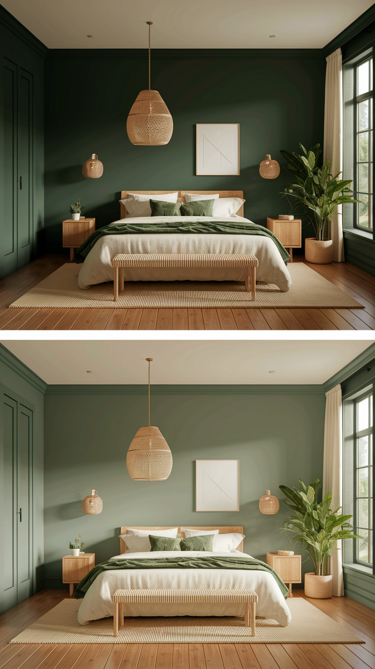
2. Serene Greens: Nature’s Stress Reliever
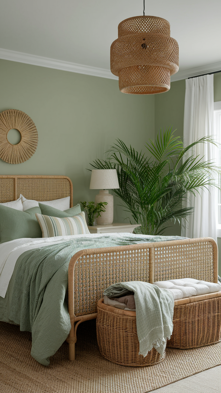
Green is basically therapy in a color. It’s refreshing, balanced, and surprisingly versatile. Green is also an ideal bedroom colour, known for its calming effect and ability to help you relax after a long day. Whether you go for sage, olive, or mint, greens bring the outdoors in — minus the bugs and hay fever.
Why it works: Green symbolizes renewal, growth, and harmony. Plus, your eyes love it — it’s one of the most restful colors to look at.
Perfect pairings:
-
Sage green walls + white trim = modern farmhouse charm
-
Olive green accents + rattan textures = cozy boho retreat
-
Mint green + brass fixtures = light, airy sophistication
IMO, sage green wins every time. It’s trendy yet timeless. And FYI — it looks gorgeous with both warm and cool lighting, so you won’t have to obsess over bulb temperatures at 10 p.m. like a lunatic (we’ve all been there).
3. Tranquil Greys: Minimalist but Never Boring
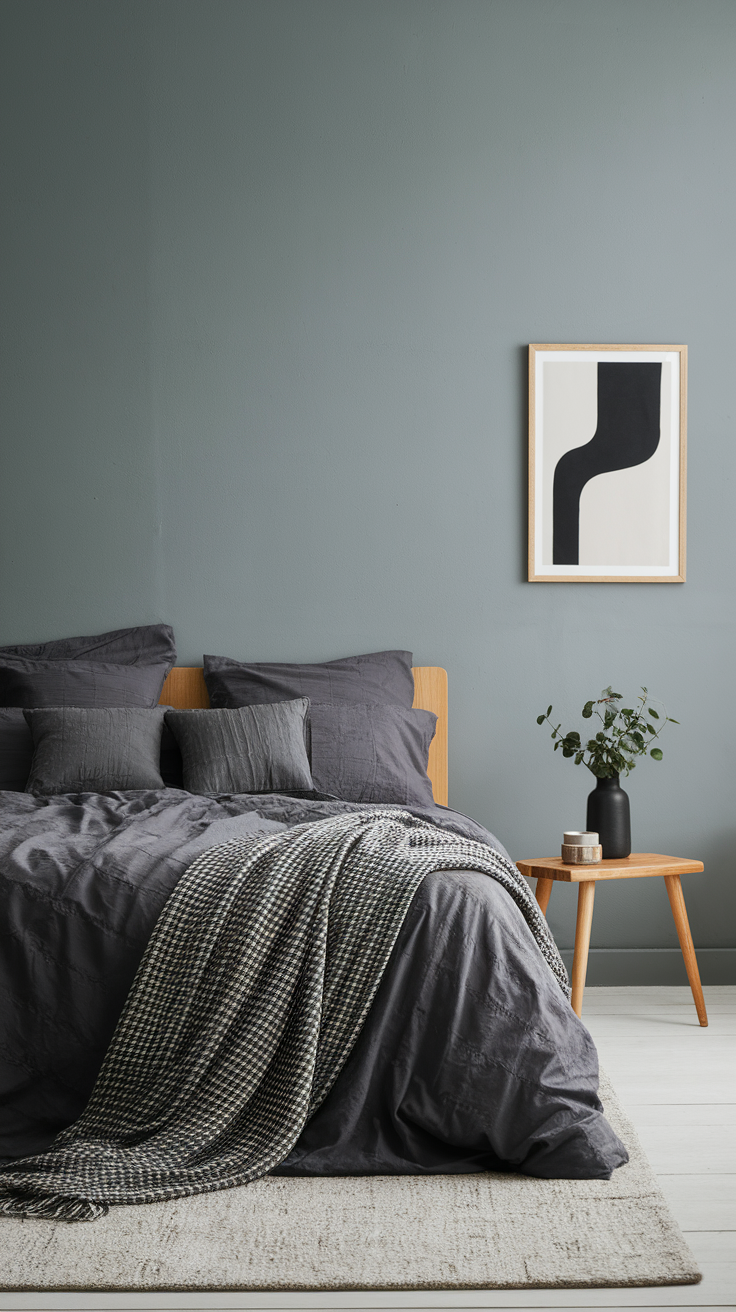
I know, I know — grey can sound a bit… meh. But when you use it right, it’s pure class. Cool greys are grounding, elegant, and go with literally everything.
Why it works: According to colour psychology, grey gives you flexibility. You can go full minimalist zen or soften it with cozy textures. Cool greys can also help soothe the senses and promote a restful environment, making them ideal for bedroom walls.
Style tip:
-
Combine light grey bedroom walls with charcoal accents and natural woods.
-
Add texture through throws, rugs, or linen curtains.
-
Pop in muted blues or greens to keep it from feeling flat.
Grey bedrooms are like a blank canvas — they let your furniture and decor shine. Plus, you can switch up accent colors seasonally without repainting every six months (because who has that kind of time?).
4. Muted Neutrals: The Effortless Cozy Palette
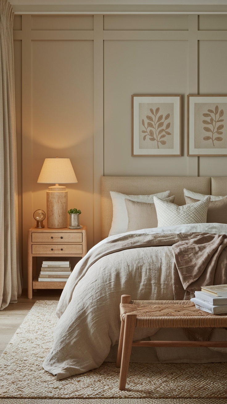
Sometimes, you just want your space to whisper “calm,” not scream “Pinterest project gone wrong.” That’s where neutrals come in.
Think: beige, taupe, cream, soft white — those warm, buttery tones that make your bedroom feel like it’s hugging you.
Why it works: Neutrals create a balanced backdrop that enhances light and texture. They also make your space feel clean, even if you shoved all your laundry under the bed five minutes ago (no judgment).
Mix and match like this:
-
Walls: warm taupe
-
Textiles: ivory bedding, linen cushions, wool throws, and other natural materials like cotton or bamboo
-
Accents: black metal lamps, wooden frames, or rattan details
This palette is especially great for small bedrooms because it reflects light beautifully. Add a touch of greenery, and voilà — instant calm oasis.
5. Misty Lavender & Lilac: The Unexpected Calm
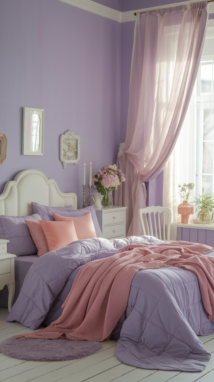
Let’s get a little daring, shall we? If you’re tired of the typical blues and greys, muted lavender or soft lilac can surprise you. These soothing hues are perfect for creating a restful bedroom environment.
These hues bring a touch of personality without shouting for attention. They’re romantic but not overly sweet — like that one friend who always smells good and never overshares.
Why it works: Light purple tones bridge the gap between cool and warm. They promote creativity and calmness simultaneously.
Pair them with:
-
Soft greys or silvers for a cool, modern look
-
Warm whites and wood accents for balance
-
Dusty pink accessories for a hint of luxury
-
Soft pinks for a gentle, sleep-friendly accent
Lavender bedrooms feel peaceful and a little magical, offering a harmonious blend of color and mood. Just avoid going full Barbie Dreamhouse. Subtlety is key here.
How to Create a Calming Bedroom (Without Going Broke)
You don’t need a full remodel to nail a calming vibe. Decorating with calming palettes supports rest and sleep, making your bedroom a true retreat. Here’s what actually makes the biggest impact — and it’s not a £500 designer paint tin.
1. Limit your palette. Stick to 2–3 colors max. More than that, and your room might start to feel chaotic.
2. Layer textures. Think linen, cotton, rattan, wool — all soft, tactile materials that engage the senses and make you want to snuggle up.
3. Use lighting smartly. Cool white light = office. Warm, soft light = relaxation. (It’s wild how much difference a bulb can make.)
4. Keep clutter minimal. You can’t feel calm surrounded by chaos. Declutter or use hidden storage to fake it.
5. Add nature. A simple plant or eucalyptus sprig does wonders for that fresh, calming vibe.
And please, don’t overmatch everything. You’re going for effortless serenity and a relaxed feel, not a hotel catalog photo shoot.
Pro-Level Tricks for Calming Palettes
Want to take your color game up a notch? Try these subtle but impactful designer moves:
-
Tone-on-tone layering: Pairing different shades of the same color (like pale blue walls paired with navy cushions) adds depth and creates a harmonious look. This technique is a wonderful choice for creating a calming, layered bedroom.
-
Add contrast wisely: Pairing light and dark elements, such as black lamp bases with deep navy bedding, creates visual balance and keeps the room grounded. This is a great choice for adding interest without overwhelming the space.
-
Play with matte finishes: Glossy = energy. Matte = calm. Opt for matte paints, ceramics, and fabrics. The deepest shade of navy in a matte finish creates a rich, restful mood—perfect for a serene bedroom retreat.
-
Use undertones to your advantage: A harmonious blend of undertones creates timeless sophistication. Blue-grey feels cooler; beige-grey feels warmer. Choose based on how you want your space to feel. This is the perfect choice for creating a refined and elegant atmosphere.
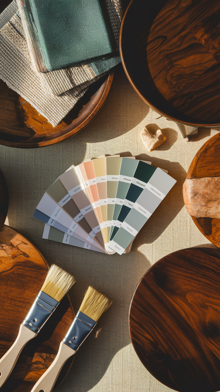
Ever noticed how one grey looks elegant and another looks like concrete prison walls? Yep, undertones. Always sample before committing, trust me.
By using these strategies, you create instant character and a rich, restful environment that elevates your bedroom design.
Real Talk: My Own Palette Journey
Okay, story time. I once painted my bedroom a deep forest green because Pinterest told me it was “moody and serene.” Spoiler: it looked more like a cave. The lighting turned it into a mossy nightmare by nightfall. I even considered brown and deep brown shades with red undertones for a warmer, cozier vibe, but worried they might feel too heavy in my small space.
I eventually switched to sage green walls, linen bedding, and natural wood accents — and now it’s my literal happy place. The new palette brought so much life and colour to the room. It feels fresh in the morning and cozy at night. Plus, every time someone walks in, they say, “Wow, this feels relaxing.” Mission accomplished.
So yeah, you’ll probably mess up once or twice before finding your perfect palette — but hey, that’s part of the fun. :)
Best Calming Palette Combinations (At a Glance)
Here’s your quick-reference cheat sheet of bedroom colours to inspire your next design:
|
Palette Name |
Main Color |
Supporting Shades / Other Colours |
Mood Vibe |
|---|---|---|---|
|
Ocean Whisper |
Soft Blue |
White, Sand Beige, Other Colours |
Fresh & Airy |
|
Morning Sage |
Sage Green |
Warm White, Taupe, Other Colours |
Natural & Grounded |
|
Urban Cloud |
Cool Grey |
Charcoal, Oak Wood, Other Colours |
Minimalist & Modern |
|
Cream Dream |
Ivory |
Taupe, Black Accents, Other Colours |
Warm & Inviting |
|
Lilac Haze |
Lavender |
Silver, Blush, Other Colours |
Soft & Romantic |
|
Sunlit Harmony |
Yellow |
White, Soft Grey, Other Colours |
Cheerful & Calming |
|
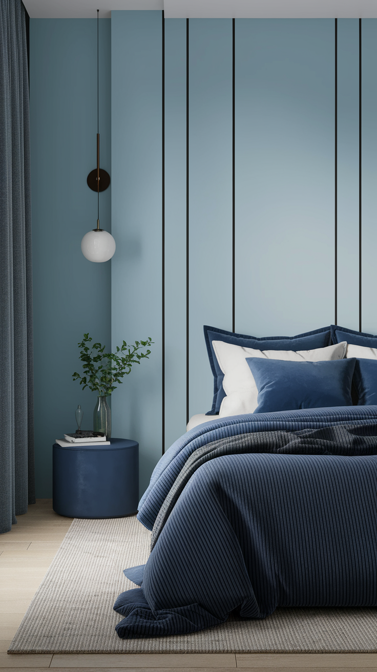
Midnight Luxe |
Dark Blue |
Ivory, Gold, Other Colours |
Luxurious & Serene |
Bookmark that table, or screenshot it if you’re currently painting samples on your wall and questioning every decision.
Accessories That Enhance Calming Palettes
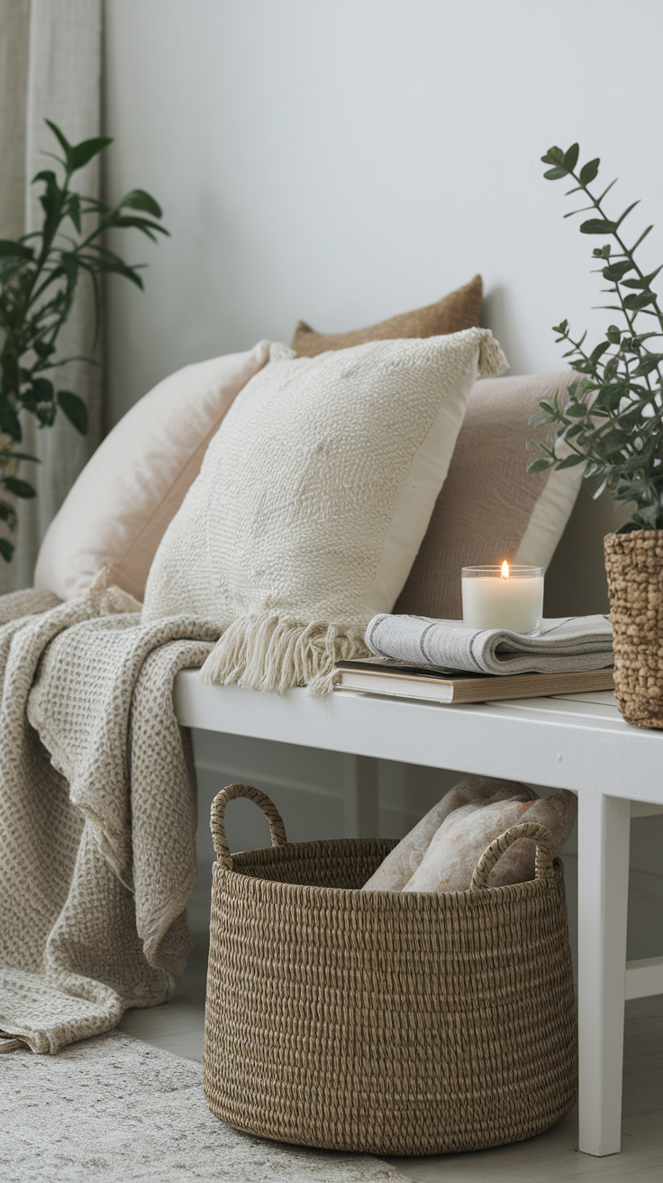
Color sets the mood, but accessories seal the deal. Here’s what to layer into your space to amplify that tranquil vibe:
-
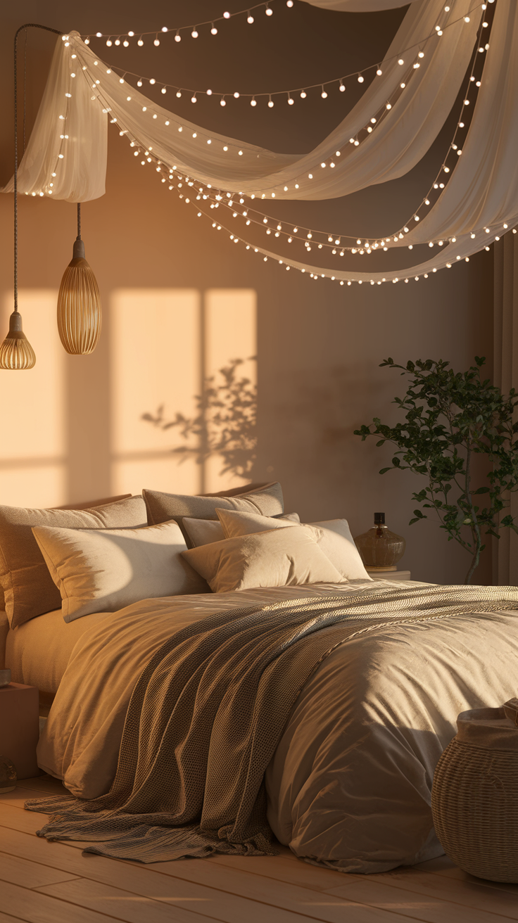
Soft lighting: Think dimmable lamps, salt lamps, or fairy lights. The way natural light interacts with these accessories and your chosen colors can dramatically affect the overall ambiance, making the space feel brighter and more inviting during the day.
-
Natural fabrics: Linen duvet covers, cotton curtains, or wool throws.
-
Artwork: Abstract watercolors or minimal landscapes in muted tones.
-
Plants: Snake plant, peace lily, or eucalyptus (bonus points for good scent).
-
Scent: Lavender, sandalwood, or cedarwood candles — instant spa mood.
-
Ceiling tip: For an extra serene vibe, consider painting the ceiling the same calming color as your walls or a complementary shade to create a cohesive, restful environment.
Just remember: less is more. You’re curating a feeling, not staging a shop window. These thoughtful choices not only enhance your bedroom’s look but also support a good night's sleep.
Common Color Mistakes to Avoid
Because yes, we’ve all made them:
-
Overmixing warm and cool tones — it confuses the eye. Stick to one temperature and be mindful not to mix too many other colours; choose complementary colours for a more harmonious look.
-
Using too much white — it can feel sterile instead of calming.
-
Forgetting lighting — a shade that looks “perfect” online might look totally different in your room.
-
Going too dark in small spaces — moody ≠ gloomy. Test first!
Ever paint a room and realize it glows like a radioactive mint under lamp light? Yep. Always sample first.
Final Thoughts: Your Space, Your Calm
At the end of the day, the best cool and calming bedroom palette is the one that makes you exhale when you walk in. Whether that’s a misty blue escape, a serene sage retreat, or a minimalist grey haven, your bedroom should be the one place where peace isn’t just an idea — it’s a color.
So grab those paint swatches, test a few shades, and trust your instincts. You’ll know the right palette the second you feel it.
And hey, if all else fails, fairy lights and a clean duvet cover can fix almost anything. ;)