
Nursery Color Palettes That Always Look Good: Ideas for Every Style
So, you’re staring at those four blank nursery walls, feeling the pressure of picking the perfect color. Different hues can create calm, joy, or playfulness in a baby’s room. This guide is here to help you choose nursery color palettes that always look good—timeless, trendy, and easy to love for years to come.
Key Takeaways
-
Choose nursery color palettes that create a soothing atmosphere and grow with your child to avoid frequent redecorating.
-
Soft neutrals, calming blues, and earthy greens are timeless hues that work well in any nursery design for a perfect nursery environment.
-
Use accent walls, patterns, and textures to add depth and personality without overwhelming the entire room.
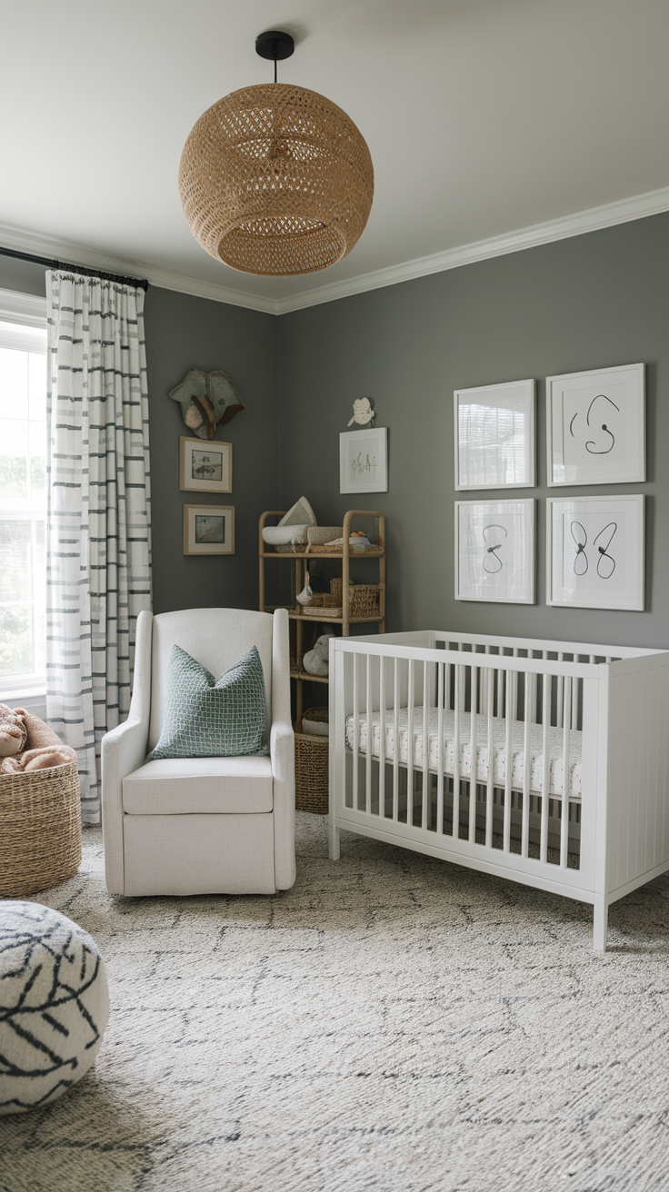
Why Choosing the Right Nursery Palette Matters
You might think, “It’s just paint, I’ll redo it later.” But let’s be real—once you’ve assembled that crib and moved in three metric tons of stuffed animals, you won’t ever want to repaint.
-
Colors set the vibe. Soft neutrals calm, bold accents energize.
-
They influence your mood too. (And if you’re sleep-deprived, mood matters.)
-
They grow with your child. Pick wisely, and you won’t have to redecorate in two years.
-
The right paint colors help create a calming environment for both baby and parents.
Choosing the best paint colors can foster a sense of comfort and support the needs of the whole family.
Ever wondered why you feel calm in a sage-green room but jittery in neon yellow? Yep, that’s color psychology at work. Babies don’t read Pantone charts, but you sure do feel the impact.
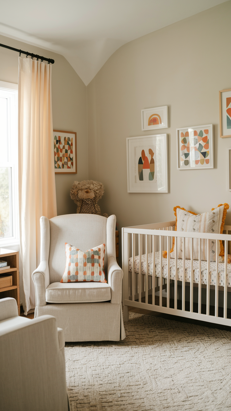
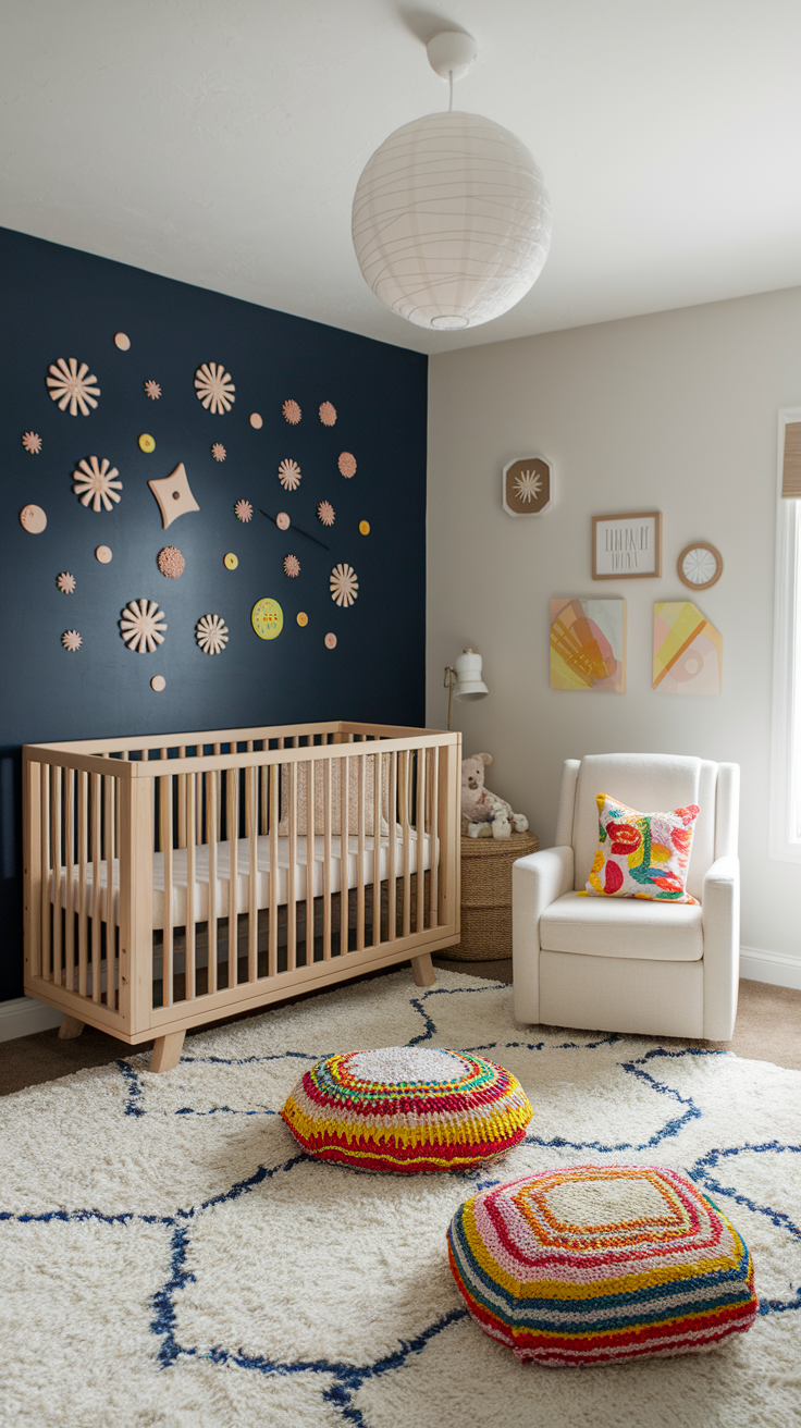
The Go-To Classic: Soft Neutrals
Beige, Cream, and Taupe
I know what you’re thinking: “Beige? Really?” But hear me out. Neutral shades are basically the skinny jeans of nursery colors—they just work.
Why people love them:
-
They make the space look bigger.
-
They let furniture and decor shine.
-
They’re gender-neutral (in case you’re going the surprise route).
-
Incorporating soft yellows or varying the tone of neutrals can add warmth and interest to the space.
Pro tip: Layer in textures—like a chunky knit blanket or a woven rug—so the room doesn’t feel flat.
Greige (Gray + Beige)
Greige has become the millennial beige. It’s warm, it’s cool, it’s everything at once. This subtle hue works with many palettes, allowing you to take a hint from other decor elements to choose the right shade. And it photographs beautifully—yes, I’m already thinking about Instagram-worthy nursery shots.
Calming Blues That Never Fail
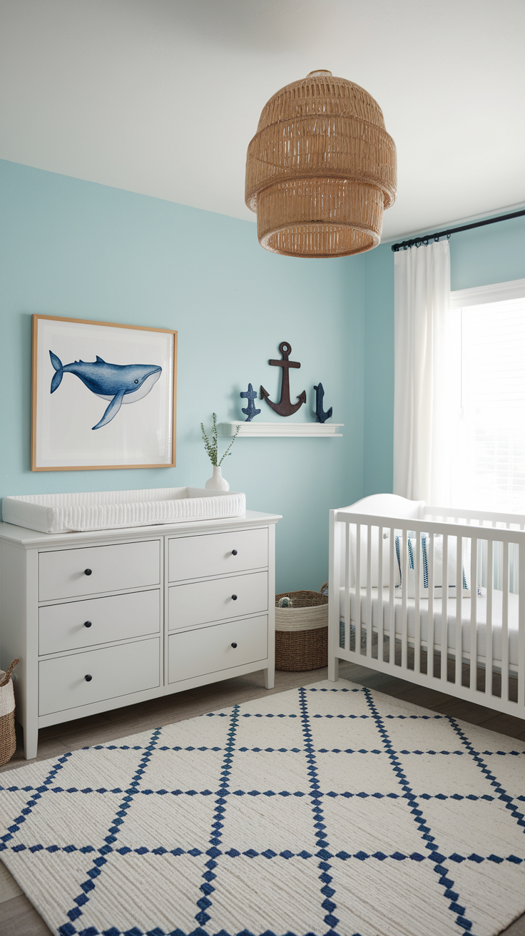
Soft Sky Blue
If you want classic calm vibes, sky blue is unbeatable. Think baby boy clichés—but fresher. It’s light, airy, and makes the nursery feel peaceful.
Pair it with:
-
Crisp white furniture.
-
Nautical touches (anchors, whales, or not, if you’re anti-theme).
-
Accent colors like soft yellow or mint to add pops of color and complement the sky blue.
Dusty Blue
Dusty blue feels more grown-up and versatile. It’s less “it’s a boy!” and more “Pinterest aesthetic.” IMO, this one ages well into toddler years and beyond.
Timeless Pinks That Aren’t Over the Top
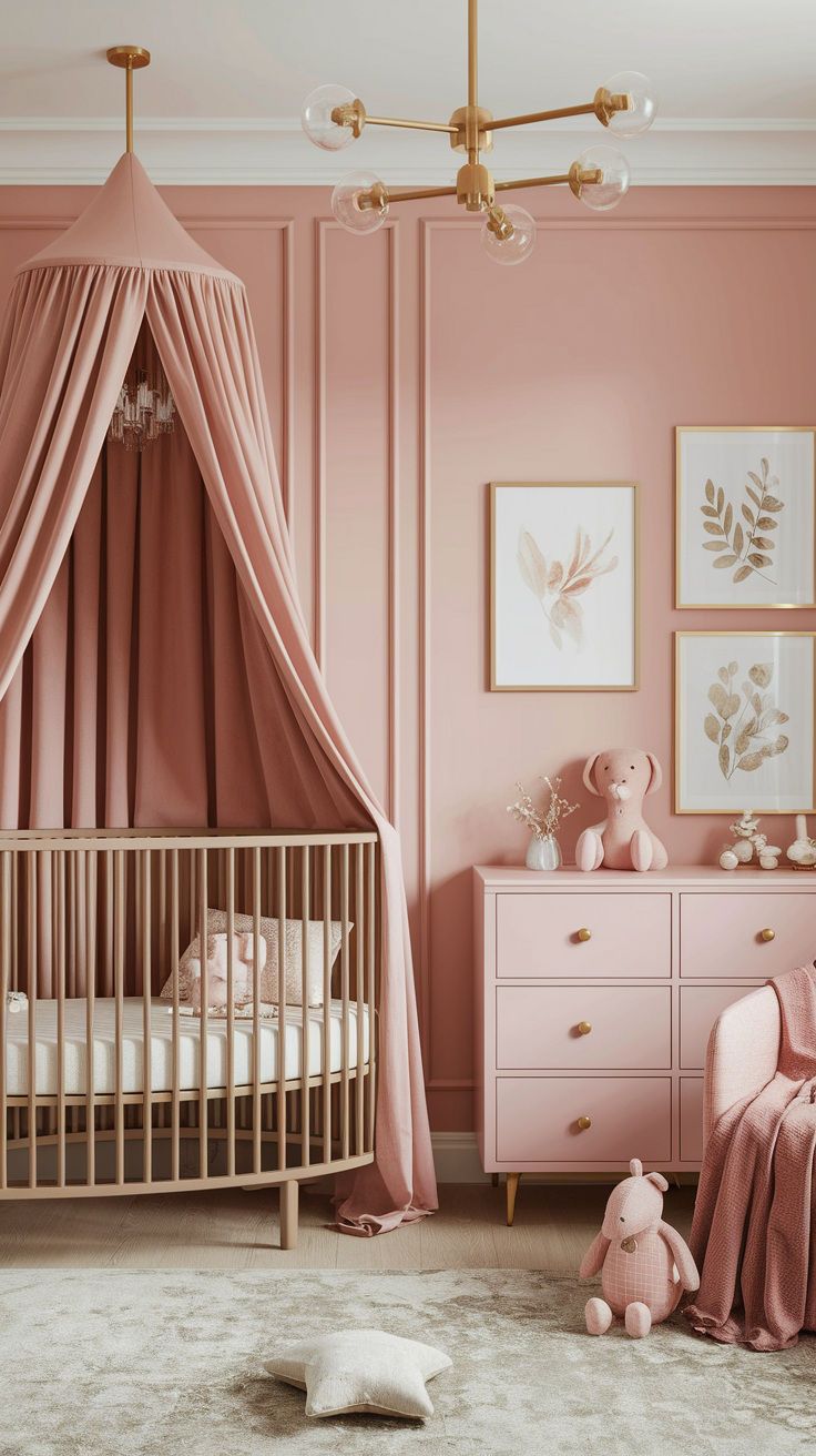
Blush Pink
Not the bubblegum pink of the 90s. Blush pink is softer, chic, and modern. It works perfectly with gold or brass accents—like drawer handles or light fixtures.
Peachy Pink
This one feels sunnier and warmer. It adds coziness without going full-on princess castle. I used peachy tones in my niece’s nursery, and it made the whole room glow at sunset—magical.
Green: Nature’s Favorite
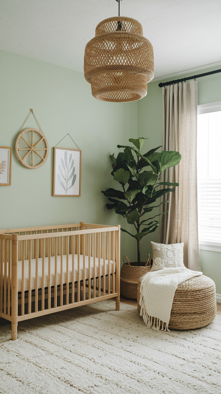
Sage Green
Sage green is basically the avocado toast of nursery colors—everywhere, but still amazing. It’s calming, gender-neutral, and pairs beautifully with wood accents.
Why it always works:
-
It connects the room with nature.
-
It’s versatile—works with boho, modern, or farmhouse vibes.
Mint Green
Mint feels fresh and playful. If sage is zen yoga mom, mint is fun aunt who brings cupcakes. Use it if you want a softer, slightly whimsical nursery.
Modern Monochrome: Black, White, and Gray
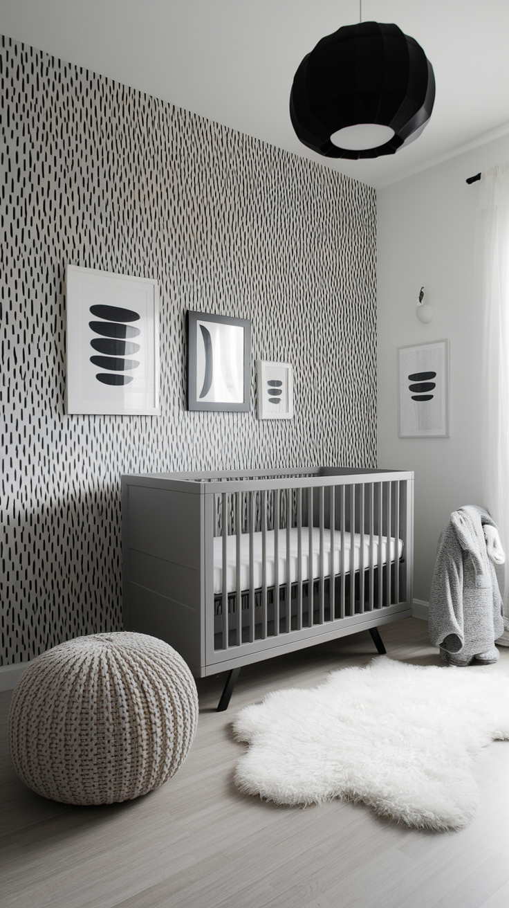
Okay, I know what you’re thinking: Black in a nursery? Are you nuts? But hear me out.
A monochrome palette looks sleek, stylish, and surprisingly cozy when balanced with softer textures. Add a fuzzy white rug, and incorporate patterned wall decals to bring visual interest and depth to a modern nursery. This use of pattern helps the space feel both contemporary and inviting, making it less “trendy loft” and more “cool kid’s room.”
Best part? Monochrome grows with your child. You won’t have to repaint when they hit age five and decide dinosaurs or astronauts are cooler than teddy bears.
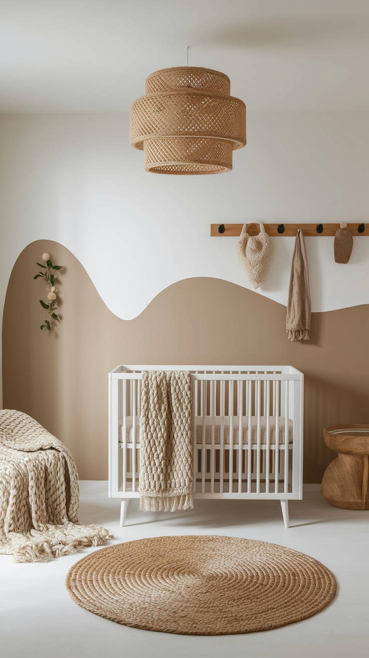
Warm and Cozy Earth Tones
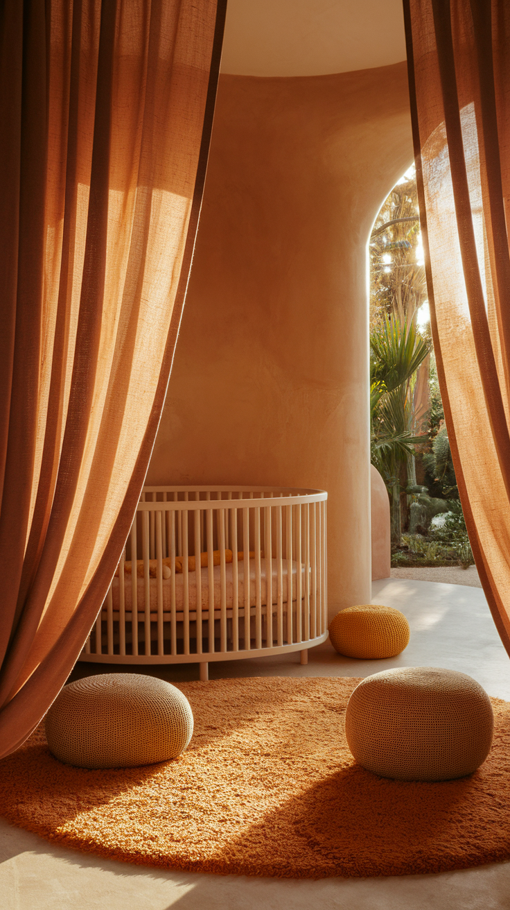
Terracotta and Warm Clay
Terracotta brings warmth without being overpowering. It feels earthy and comforting, perfect if you’re into that natural, grounded vibe.
Mustard Yellow
Not neon. Not banana. Mustard yellow adds cheer without blinding your eyeballs. It pairs beautifully with gray, navy, or even blush tones.
This combo screams cozy autumn vibes year-round. Honestly, I’d nap there even if I weren’t a baby.
Gender-Neutral Combos That Always Work
When in doubt, mix and match neutrals with one soft accent color. These combos make it easy to decorate a baby's room that can adapt as your child grows, allowing you to personalize the space while keeping it functional and beautiful.
Some foolproof combos:
-
Gray + White + Sage = modern calm.
-
Beige + Cream + Dusty Blue = cozy and chic.
-
Blush + Taupe + Gold = soft but stylish.
These palettes don’t scream “boy” or “girl,” which is perfect if you’re keeping things flexible—or if you just don’t want your house to look like a toy store exploded.
Adding Pops of Color Without Regret
Sometimes you want neutral walls but still crave a little personality. That’s where accents come in.
Options that won’t make you cringe later:
-
Accent wall in a bolder color (think navy or sage).
-
Wall decals you can peel off when the toddler phase hits.
-
Rugs, curtains, and pillows that add color but can easily swap out.
-
Artwork like cheery wall art or inspiring prints, which can introduce a hint of color and visual interest without overwhelming the space.
Trust me, you’ll thank yourself later when your kid decides purple dinosaurs are the best thing ever. Just change the rug instead of repainting.
Patterns and Palettes That Age Well
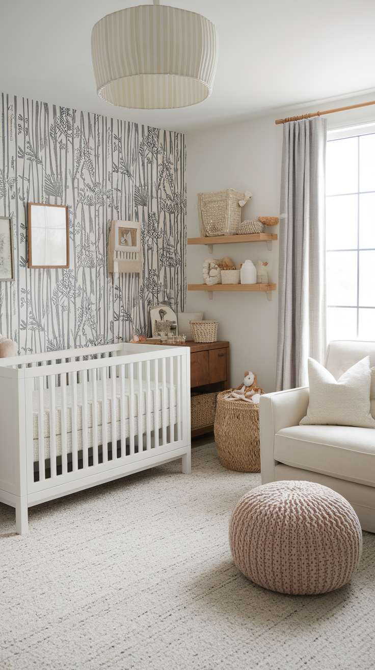
Babies grow fast (like, overnight fast), so think long-term.
-
Stripes add a playful yet timeless touch.
-
Polka dots feel fun without locking you into a theme.
-
Botanical prints pair well with sage or mint.
Pro tip: Use patterned wallpaper on just one wall. It creates a focal point without overwhelming the space. A mural can also serve as a long-lasting focal point, transforming a plain wall into a magical scene that grows with your child.
My Personal Favorites (Because Opinions Matter)
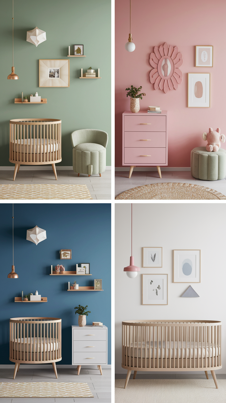
Alright, IMO, these are the palettes that always steal the show:
-
Sage Green + Cream + Natural Wood. It’s cozy, calm, and super versatile—a great choice for creating a soothing nursery. If you have a botanical print or a wooden mobile as your inspiration piece, this palette ties everything together beautifully.
-
Blush Pink + Taupe + Gold. Chic, modern, and perfect for those dreamy Instagram pics. This is a great choice if you want a soft, elegant vibe. A favorite inspiration piece here might be a delicate wall art or a plush toy that sets the tone for the whole room.
-
Dusty Blue + White + Gray. Clean, timeless, and ridiculously photogenic. This palette is a great choice for a classic look, especially if you start with an inspiration piece like a watercolor painting or a patterned rug to guide your color selection.
I’ve helped friends put these palettes together, and every time, the rooms looked effortlessly beautiful. Zero regrets.
Quick Tips for Picking Your Perfect Palette
Because I know analysis paralysis is real when it comes to color swatches:
-
Test before you commit. Paint swatches on the wall and see them at different times of day.
-
Think about furniture. White crib? Natural wood dresser? Pick colors that complement.
-
Don’t overcomplicate. Stick to 2–3 main colors max. More than that, and it feels chaotic.
-
Remember the lighting. A color that looks dreamy in daylight might look like a dungeon at 8 p.m.
-
Note your inspiration. Whenever you find a palette or idea you love—on Pinterest, Instagram, or in a magazine—note it down or pin it so you can keep track of what stands out to you.
Choosing timeless colors can provide a sense of security for your baby’s room and will stand the test of time as your child grows.
Ever notice how the “perfect gray” looks purple at night? Yeah, lighting plays tricks.
FAQs About Nursery Color Palettes
What is the most visually appealing color palette?
Honestly, the most visually appealing palette is usually neutral tones with one standout accent color. Think soft beige walls, white trim, and a pop of sage or dusty blue. This combo feels clean, calm, and balanced without being boring. Plus, neutrals never go out of style, so you won’t feel like you need to repaint every time trends change.
What is the best color scheme for a nursery?
The best nursery color scheme is one that feels calming for you and adaptable for your baby as they grow. Popular go-tos are:
-
Sage green + cream + natural wood for a cozy, earthy vibe.
-
Blush pink + taupe + gold if you like something soft and chic.
-
Dusty blue + white + gray for a clean, timeless look.
At the end of the day, it’s less about “rules” and more about what makes you feel relaxed—because let’s face it, you’ll spend a lot of late nights in that room.
What is the 60/30/10 rule for colors?
The 60/30/10 rule is basically the secret sauce of decorating. Here’s the breakdown:
-
60% = your main color (usually the wall color).
-
30% = your secondary color (like furniture or rugs).
-
10% = your accent color (pillows, art, curtains, etc.).
It keeps things balanced so your nursery doesn’t look like a rainbow exploded. ;)
What are the most popular nursery colors for 2025?
For 2025, the nursery world is all about calm, earthy, and gender-neutral palettes. The top contenders?
-
Sage green (still going strong).
-
Terracotta and warm clay (for that cozy, natural feel).
-
Dusty blue (a timeless classic).
-
Blush pink (but the softer, more modern version).
-
Warm neutrals like greige and cream.
These shades feel fresh, modern, and—bonus—totally Instagram-ready. IMO, it’s the perfect mix of stylish and practical.
Conclusion
At the end of the day, nursery color palettes that always look good are the ones that make you feel calm, happy, and at home. Babies don’t care if the walls are sage green or terracotta. But you will care when you’re rocking them to sleep at 3 a.m. in a space that feels soothing instead of chaotic.
So, go with timeless neutrals, calming blues, soft pinks, earthy greens, or cozy warm tones—mix in some personality with accents—and you can’t go wrong.
And hey, if all else fails, just pick the color that makes you smile every time you walk in. Because honestly? That’s the one that always looks good. ;)